|
| In order to make up one's mind about glyph scaling and letterspacing in text justification, it is informative to read what central figures in the typographic world think about it. These authorities have differing opinions. |
||
|
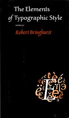
«Tiny adjustments... creating a page of even color and texture» Robert Bringhurst Most of the type set in the past five hundred years is justified type, and most of it has been justified line by line. There are, however, better ways. Scribes justify text as they write, by introducing abbreviations and subtly altering the widths of letters. Gutenberg replicated the feat by cutting and casting a host of abbreviations and ligatures along with multiple versions of certain letters, differing modestly in width. In the early 1990s, Peter Karow and Hermann Zapf devised a means of doing much the same in the digital medium - and without relying on scribal abbreviations. (...) Another thing computer software can do – because Karow taught it how – is justify text by making subtle alterations in the widths of letters. Good justification is calculated paragraph by paragraph instead of line by line. And the best computer justification now relies on microscopic adjustments to the space between and within the letters as well as the space between the words. In this book, for example, the justification engine has been permitted to vary the intercharacter spacing by plus/minus 3% and to adjust the width of individual glyphs by plus/minus 2%. The bulk of the work is still done by adjusting the spaces between words, but there are more letters than spaces in these lines. Tiny adjustments to spaces within and between the letters therefore go a long way toward creating a page of even color and texture. |
AN IMPORTANT THEORIST |
|
|
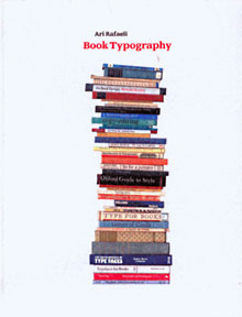
«Regrettable... that such a distortion of letterforms is 'typographically acceptable'» Ari Rafaeli Adjustment of character-space – increasing or decreasing – by various methods to mitigate the excessive word-space which occurs when an inappropriate measure is used, or when hypenation is inadequately applied, is an expedient which has been practised since the early 1960s when second-generation filmsetting made it possible, but it has never been done to good effect. There seems lately to be a trend in this direction notwithstanding and automatic modification of character-space and also of character widths (to reduce hyphenation and render closer word-space) are featured in one of the newer but already very popular applications, Adobe InDesign. (...) ... one should expect the option (for glyph scaling, my comment) to cause a distortion of each character of an affected line of justified text and perhaps the characters of the preceding or following lines to also suffer distortions, though differently, as widening or condensing will occur according to the amount of word-space which wants either reducing or increasing. Only the slightest distortions, of course. It is regrettable that the venerable designer of some of the best types of the twentieth century should say that such a distortion of letter-forms is 'typographically acceptable'. It may be argued that the distortions, because they are ever so slight, won't be noticed but that is not true: I can see them very well in Hermann Zapf's example. |

VALUABLE ARTICLE ON THE NET http://www.oakknoll.com/ |
|
|
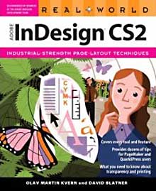
«Glyph scaling is evil, unprofessional, and should be removed from InDesign» Olav Kvern CONTRIBUTION NO. 1: Harbs wrote: «No one will ever notice a tiny bit of glyph scaling, and it can make a *huge* difference in spacing!» I disagree completely. Whether one can consciously notice the squashing and stretching of characters or not, one can certainly «feel» the difference. Glyph scaling is evil, unprofessional and should be removed from InDesign. If you can't solve spacing problems with word spacing and judicious use of hyphenation, then a rewrite is called for. I would rather letterspace than use glyph scaling – and I would rather die than use letterspacing. CONTRIBUTION NO. 2: The question, though (even if «nobody will notice» – which I dispute) is: why take the chance? Other methods exist that do not distort the shapes of the characters. If the reader's eye is sensitive to variation in letter spacing – as seems to be shown by a variety of studies – then we can only assume that it's even more sensitive to variation in character shape. (...) There is no such thing as perfect spacing for any text. There is only the best one can do, given other considerations. (...) Clearly, the ideal (for text in English, at least) is to set text flush left and use hypenation sparingly to keep the line lengths similar. Then you don't have to worry about the problems introduced by justification. There is nothing good about justification from the reader's point of view. |

INDESIGN GURU |
|
|
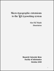
«Font expansion ... must be used with great care» The Thanh Han The improvement of interword spacing depends on the expansion limits. On the other hand, too high expansion limits causes that the effect of font expansion to be visible and thus detracts from the appearance of the typeset text. Choosing expansion limits for a font is thus not trivial and must be done carefully so the effect of font expansion cannot be visible. My experiments have shown that it is safe to expand fonts within such a limit so the variance in character widths must not exceed +/- 2%. (...) Font expansion helps to improve interword spacing and thus uniform greyness of a typset text, but it must be used with great care. To draw general rules for its use is not easy, since people tend to value the quality of a typeset document differently. While top quality typographers seem to agree on aspects like optimal grayness and what kind of manipulations are permitted, the average desk top publisher is very tolerant in applying generous spacing and seemingly arbitrary stretching of glyphs and kerns to achieve his personal objectives. (...) |

IMPORTANT THEORETICAL WORK |
|
|
See a short presentation of myself here. Published for the first time (in Norwegian) 2007-05-15. Published for the first time (in English) 2008-12-24. |
||
