|
|
It is claimed that the option in Adobe InDesign to vary glyph (character) widths as a part of the justification is based on the composition technique of Gutenberg in his 42-line Bible (1455), and on the font designer Hermann Zapf's hz-program (with URW, 1992). An examination of this claim raises serious doubts about the validity of the references to these highly respected authorities. I believe that the frequent references to Gutenberg and Zapf have lead to the acceptance by many designers of this option in text justification. One of the most important spokesmen for glyph scaling being Robert Bringhurst, who claims that InDesign's option for varying glyph widths is «an electronic version of what Gutenberg envisioned in the 1440s». As I am most critical of glyph scaling in text justification, it has been interesting to examine these claims. BACKGROUND The downside of this is that the design of the characters and the word-images are altered, and that lines with this effect will appear different from other lines. For example, lines with condensed characters may seem to be composed in a different (a smaller) point size than other lines. Affected lines will become either lighter or darker, and create an uneven colour (greyness) on the page. This may disturb the reader both when taking a first look on the page, and later when reading it. This irregular appearence of the text and the uneven colour are generally judged as negative. I believe that this negative side far outweighs the positive intentions of glyph scaling. |
Is Johannes Gutenberg's composition technique relevant today? |
|
|
It is not difficult to find examples of text where glyph scaling is put in effect. In 1993 The Seybold Report on Publishing Systems wrote on the hz-program, after having examined only one page composed with glyph scaling: «On close inspection, it is possible to see expanded characters (compare wide characters on consecutive tight/loose lines), but the average eye isn't likely to notice this.»(1) We can now better judge this technique. I have discussed these problems with glyph scaling (and the even worse technique of letterspacing) in detail here (in Norwegian, but with many illustrations). HERMANN ZAPF |
(1) Karsh, Arlene E.: Composition Quality: Can URW ’One-Up’ Gutenberg with hz-Program? In The Seybold Report on Publishing Systems, Vol. 22, Number 11 (1993). | |
|
Zapf discovered that the secret behind the much admired B42 was the «even grey areas in his two columns» of text. This effect was created by no «disturbingly wide holes between the words». Zapf continued: «His secret: the master achieved this perfection by using several characters with different widths, combined with ligatures and abbreviations, in his lines.»(2) Gutenberg used altogether 290 different types for the composition of B42, to achieve this. Approximately 60 types would have sufficed to compose the text without this intention to avoid wide word spaces. See these 290 different types here. OBJECTION NO. 1: GUTENBERG'S WAY OF NARROWING TYPES CAN'T BE COPIED TODAY
|
(2) Hermann Zapf: About micro-typography and the hz-program. In Electronic Publishing, Vol. 6(3), pp. 283–288 (September 1993). There is a link to this article on this webpage. THE HZ-PROGRAM Please note that the hz-program includes more than glyph scaling: optical kerning, multi-line composing and hanging punctuation are techniques which I believe have positiv effects. These are also included in Adobe InDesign. |
|
|
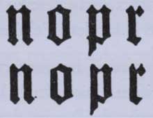
Zapf and URW's Peter Karow were convinced that as Gutenberg made types of varying widths for some characters, this was also an alternative with our present day latin (roman) letterforms. The weakness of this theory is that Gutenberg in his narrower types (notice that Gutenberg only made types narrower, not wider, as Zapf/URW/InDesign’s «glyph scaling» suggests!) only cut off some corners/«noses» from his blackletter types, corners which originated from the model pen strokes. Gutenberg kept the counters the same (a counter is for example the space between the vertical strokes of «n»). For this reason, Gutenbergs narrower types hardly stand out as different in the text. See the illustration on the right hand side. I must make a reservation here, as today’s readers are not used to reading blackletter text, and that B42 with its latin language is even more inaccessible. For this reason it is hard to judge the typography of B42. It may be that today’s readers view the B42 more as an image, as a piece of art, than as a text to be read. Contrary to Gutenberg's identical counters in both the normal and narrower forms, in Zapf and URW's hz-program the counters are narrower or wider in the glyphs with altered widths. For this reason, they to some degree stand out from the normal glyphs. This illustration from Karow’s article (3) shows the effect on two words. This illustration from Zapf's article (1) shows the effect in a block of text. Compare the first and the second to last line: the consequences of varying glyph widths are striking. It has to be added that of all Gutenberg's 290 B42-types, there are many ligatures and abbreviations, while the number of single characters with varying widths is small. (See illustration here.) The use of ligatures and abbreviations was absolutely crucial for Gutenberg's justification technique, which could not be realized by narrower types only. And my argument is that his narrower blackletter types are not relevant for our latin (roman) letterforms. There were also other peculiar justification techniques in B42: space was occasionally added before punctuation marks in order to fill out lines of text and reduce word spaces, a practice which is unheard of today (see illustration on the right hand side). All in all it seems impossible to recreate Gutenberg's typography only with varying glyph widths. OBJECTION NO. 2: GUTENBERG'S WORD SPACES WERE NOT IDENTICAL In the abstract of an article by URW's Peter Karow about the hz-program, it is stated: «Zapf and URW wanted to renovate in the age of computers that what Johannes GUTENBERG had achieved five hundred years ago: namely, a justified setting of text with equal inter-word spacing and optical straight aligned margins.»(3) And Karow says himself: «The hz-program, finally, composes text without changing the word interspacing following the rules of Johannes Gutenberg and his 42-line Bible.»(4) |
Types from Gutenberg's 42-line Bible. On top the normal forms, under these the narrower forms, which lack the corners of the upper types on their left hand side. The narrower forms were meant to be placed to the right of types which had such corners on their right hand side. In this way the types could ble placed closer to each other, and space be saved. From Aloys Ruppel: Johannes Gutenberg. Sein Leben und sein Werk. Berlin 1939. Also published in Eli Reimer: Den satstekniske utvikling. Copenhagen 1983. - Gutenberg's narrower types are also described in Adolf Wild: La typographie de la Bible de Gutenberg, in Cahiers GUTenberg, Septembre 1995. Gutenberg's 42-line Bible: Notice the full stop with space in front of it, and one colon with, and one without space before it.
(4) Lau, J. and Karow P.: hz-Program: Micro-Typography for Advanced Typesetting. SID 93 Digest, p.59-60. |
|
|
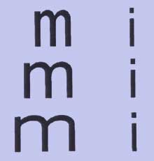
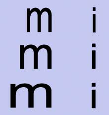
A close examination of B42 shows that word spaces are not identical after all (see illustration on the right hand side). The variations may be small, but Gutenberg did not succeed in justifying B42 with identical word spaces – if he had this objective at all, an objective he has been attributed in the following years. In my opinion, the strive for equal word spaces is futile. It disregards hundreds of years with examples of excellent typography where word spaces have varied. Word spaces should not vary too much, but can vary within a carefully defined minimum and a maximum value. OBJECTION NO. 3: INDESIGN'S GLYPH SCALING IS INFERIOR TO THE HZ-PROGRAM'S But InDesign's way of varying glyph widths is simpler than that of the hz-program, and the result is inferior typography. When the hz-program scales the characters horizontally, the vertical strokes are kept the same. Peter Karow in his article (3) stated that the letter «i» could not be made wider or narrower in the glyph scaling of the hz-program. See the top grey illustration on the right hand side. InDesign, on the other hand, not only scales the width of characters, but scales also the vertical strokes (they become wider = bolder or narrower = lighter). This make lines of text in which InDesign has changed glyph widths stand out, even more so than in the technique which Hermann Zapf and URW offered. See the bottom grey illustration on the right hand side. It has been suggested that InDesign's glyph scaling demands «Multiple Master»-fonts. This font format varies characters between two or more axises, e.g. between a wide and a narrow extreme point, and then all positions in between are esthetically acceptable. InDesign's mechanical expansion or condensation of regular fonts is not good enough. CONCLUSION |
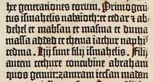
Gutenberg's 42-line Bible: The word spaces on the third and second last line are clearly wider than on the second and fourth line. B42 can be studied on British Library's internet pages:
|
|
| Dear readers
As I believe that glyph scaling in text justification leads to reduced typographic quality, I decided to investigate the background for this technique. My reason for publishing this article in English as well as in Norwegian is to find a wider audience for my arguments, which I can't see have been raised elsewhere. I want to find out whether there are anybody else who is interested in this topic, either sharing or disagreeing with my views. Please contact me here. See a short presentation of myself here. Published for the first time (in Norwegian) 2007-07-26. Published for the first time in English 2007-09-12. |
NOT ONLY INDESIGN Glyph scaling in text justification is also available in Adobe Illustrator, Adobe Photoshop and in PDFTeX (a typesetting system popular in academia). It's been done interesting work on glyph scaling within the TeX community. |
