An authority in typography at the end of the 19th century
Albin Maria Watzulik and Scandinavia
The Hungarian-German typographer Albin Maria Watzulik (1849–1930) was well known and highly respected in the Germany-influenced parts of the printing trade. In Scandinavia too, he was an authority in the decorative typography of his time. Today, this ‘grandmaster of typography’, as he was called by some admirers in Norway, is forgotten. Why?
Av Torbjørn Eng
Watzulik was a prominent representative of his time’s prevailing taste in German decorative typography. In the 1890s this was above all the so-called artistic printing (in German ‘die freie Richtung’ = ‘the free style’) – in English terminology also: Victorian typography. German typefaces and printing tools had an important market in Scandinavia, and with this trade followed German tastes and practices. German journeymen in the printing trades visited Norway for work, and some of them settled down for good. Watzulik therefore had a considerable influence in Denmark, Sweden and, in particular, Norway.
Watzulik wrote articles about typography in several volumes of the Swedish trade year book Boktryckeri-kalender. In a Norwegian context it is interesting that the German-Norwegian printer Max Rich. Kirste was an apprentice in the years around 1890 in the printing office where Watzulik was employed, in Altenburg, Germany0. They kept in touch even after Kirste settled down in Norway. Hermann Scheibler, also German-Norwegian, who eventually became the owner of the large Fabritius printing house in Christiania (Oslo), was also a colleague of Watzulik in Altenburg before travelling to Norway in 1878. When Watzulik died, a lenghty obituary about his life was published in the Norwegian trade year book Norsk boktrykk kalender. This was only awarded to the most prominent deceased printers. He was a ‘phenomenal typographer’, according to the Swedish trade journal Svenska boktryckareföreningens Meddelanden.
When researching for my book Da typografien ville være kunst : Norsk typografi 1800–1900 – fra nyklassisisme til historisme og den frie retning (2021/2022) I examined the archives after the two prominent Norwegian printers Kirste and Scheibler. I became aware of the big influence Watzulik had had on them, and subsequently for the Norwegian printing trade in general. Albin Maria Watzulik has therefore his deserved place in my book – which is a multifaceted history of the graphical trades in Norway, and to a large extent about the period to which Watzulik is most strongly associated.
Today little is to be found about Watzulik, in print as well as on the internet. Was he overrated in his own time, or is he underrated today? Maybe this article can elicit more information.
Albin Maria Watzulik was born in 1849 in Nagyszombat in Hungary (today’s Trnava in Slovakia). At the age of four he became deaf, and later also dumb. He trained as a compositor at the local printer’s, and thereafter worked in Graz. In 1873 he was sought after by the respected Pierer’sche Hofbuchdruckerei in Altenburg, in today’s German state of Thuringia. Here he was employed until retirement, engaged in so-called ‘jobbing printing’. Watzulik was strongly committed to the cause of the deaf and dumb, and participated in their congresses in the USA in 1893 and 1904.
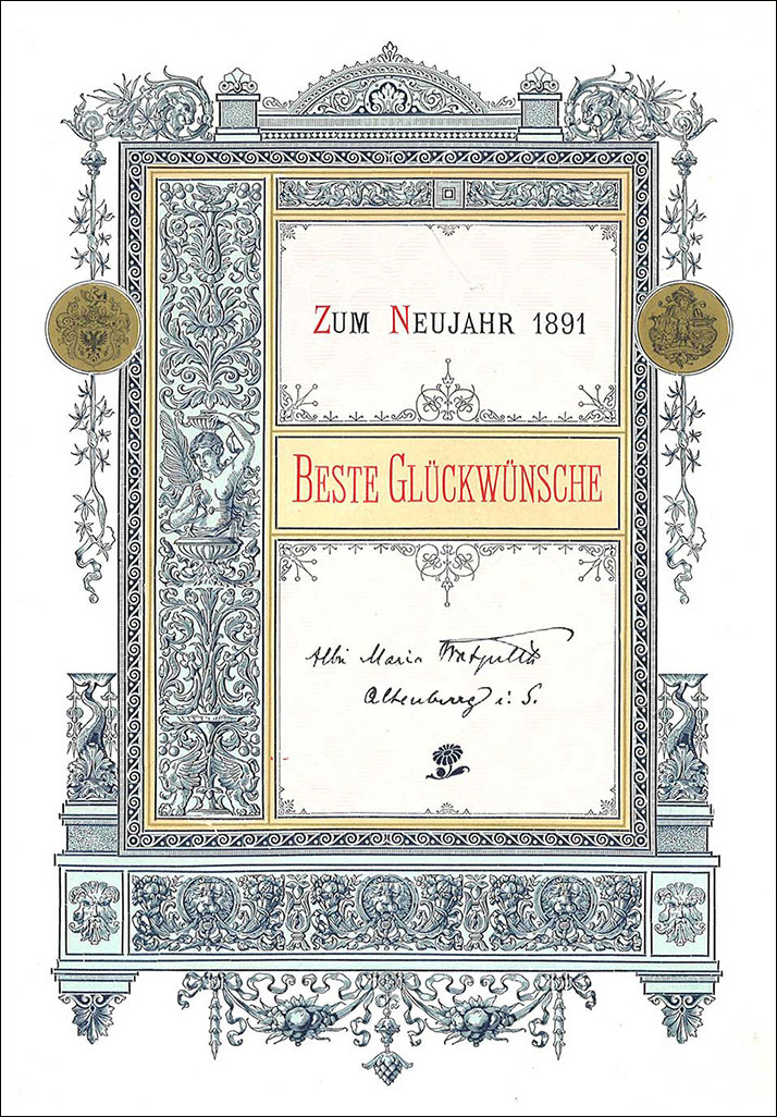
A New Year card from Albin Maria Watzulik in a ‘historicist’ Renaissance expression (1891). The text says ‘For New Year 1891 – Best Wishes’.
Lived through several different styles
Watzulik practiced as a compositor while living through several styles changes. The development of typographic style during these years went from historicism, later the Victorian ‘artistic printing’ and then on to art nouveau. What characterizes these periods?
During the ‘historicism’ of the 1870s and 1880s typographic decorative material was inspired by former historical styles, like the Renaissance, the Gothic and the Baroque. Type foundries had ornamental borders, fleurons etc designed in these styles for sale, and printers assembled them into often extravagant decorative lay-outs (see example above).
«Die freie Richtung» (artistic printing) of the 1890s was partly a consequence of the competition which letterpress printing was facing from lithographic printing. While the printing form in lithography (a piece of limestone) can be freely prepared, with ink and brushes and chalks, in letterpress the lay-out is hampered by the squareness of the typographic material, made in metal. In order to imitate litography, the elements in the typographic make-up were nevertheless placed diagonally, fitted into arcs etc, while brass rules were bent. As if in a metal workshop, sawing, filing and solding might be necessary to obtain the desired result. Different and ofte fanciful typefaces were mixed into the same work. The traditional axial symmetri was also often abandoned. – This Victorian typography was «free» compared to the hitherto restrained typography based on rules from centuries of tradition (see example below).
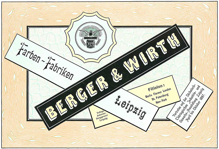
A specimen of Watzulik for a German printing ink-factory, in line with the principles of ‘die freie Richtung’ (1897).
Towards the end of the 1890s a reaction to ‘die Freie Richtung’ appeared, as it had departed too far from the original character of letterpress printing. Additionally, this Victorian style was very labour-intensive and accordingly seldom profitable, neither for the printers nor their customers.
In the 1890s, the English printer and designer William Morris represented a completely different approach to typography. His ideals were the first printers in the history of printing, from the Gothic to Renaissance, and he printed his books in an arcaic, heavy style of their time. This was a revolution in the printing trade, which increased the understanding of the traditions of printing. But even if Morris’ artisanal and antiquated typographic style inspired many printers, it had no future in an industralized world..
A specimen by Watzulik in art nouveau (year unknown).
But Morris’ work and thinking would inspire to art nouveau: a completely new, decorative style, in which typefaces and ornaments were inspired by the soft, curwed forms in nature. Art nouveau typography was more simple to produce than the Victorian ‘freie Richtung’, and had its heyday from a few years before 1900 until 1910.
Styles in ‘jobbing printing’
Historicism, Victorian ‘freie Richtung’ (artistic printing) and Art nouveau are all distinctly decorative styles; they make use of beautifying and attention-raising elements. The period in which they flourished, was marked by an increased mass-production of goods and by growth in trade, so it was within printed products like advertisements, price lists and letterheads, so-called ephemerals, that these styles were exercised to the full. This branch of printing was called jobbing printing.
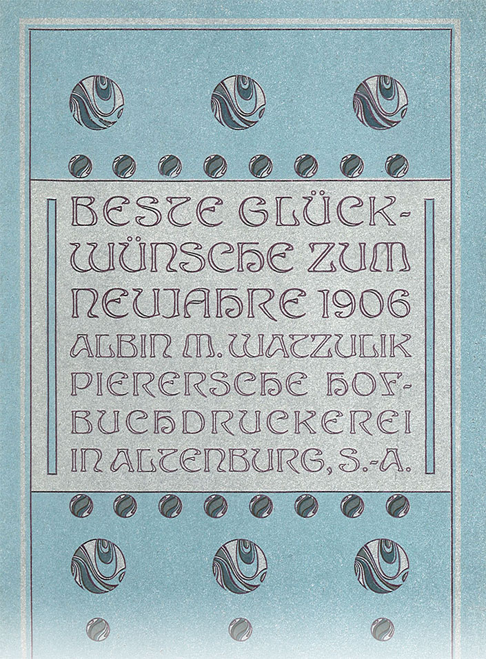
A New Year card by Watzulik in art nouveau style (1906). See full size here.
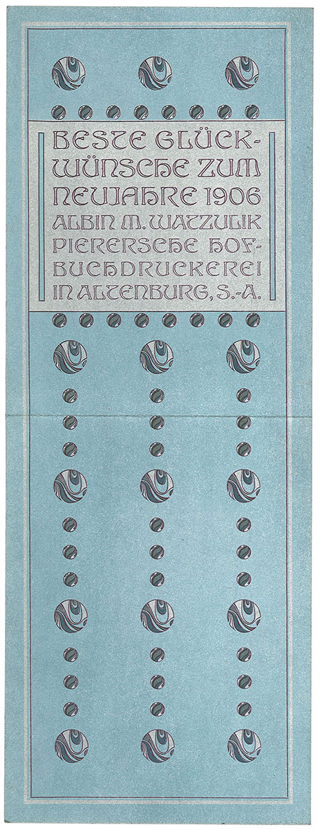
Albin Maria Watzulik practiced all of these three styles, as shown by the illustrations above. But it was during the Victorian ‘freie Richtung’ in the 1890s that he played an important role in Scandinavia. He was engaged as a judge in several Scandinavian competitions in typography. When the Swedish printer Wald. Zachrisson in 1893 started publishing his yearbook Boktryckeri-kalender, Watzulik was a regular contributor of articles until 1897. Thereafter there were none, and the reason may be that Boktryckeri-kalender from that time on changed its style towards William Morris and art nouveau. The Victorian style of printing was soon to be abandoned, and Zachrisson didn’t look back.
But a few years later Watzulik designed beautiful items in art nouveau style as well, as can be seen from the examples above. So he maintained his good reputation in the printing trade even into the 20th century. During the international printing exhibition ‘Internationale Ausstellung für Buchgewerbe und Graphik’ (Bugra) in Leipzig in 1914, a separate room was dedicated to his work.
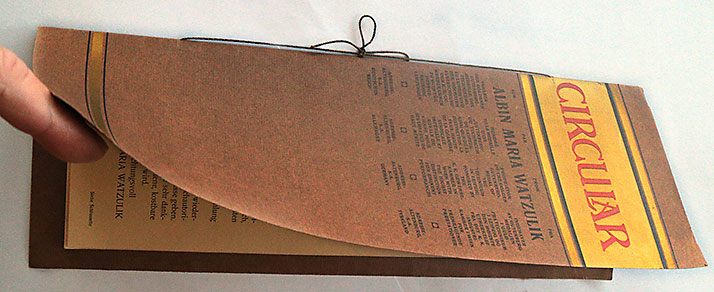
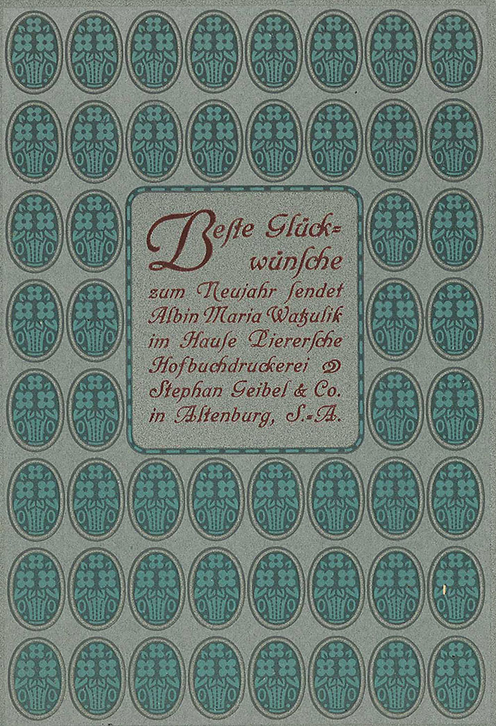
In the 1920s Watzulik wanted to sell his large collection of printed specimens. This brochure in four languages was published for this purpose.
Watzulik’s collection of specimens
The master printer Max Rich. Kirste in Oslo wrote on March 18 1922 to his Swedish colleague Waldemar Zachrisson in Gothenburg: ‘Our mutual friend, my former teacher in typography Watzulik, has many times during the last years been writing to me, asking for help to sell his large collection.’
Kirste asked Zachrisson to join him in this effort, but Zachrisson hesitated: ‘... it can’t be concluded, that his collection has any real value except as a curiosity in a museum, because I assume that it is just outdated stuff, and thus any learning can’t be gleaned from these specimens.’ Their correspondance is now in the library of the University in Gothenburg.
Time had run away from the typographic accomplishments of Albin Maria Watzulik. Many printers would agree with Zachrisson in that artistic printing had nothing to teach the printing trade in the 1920s. At the start of the decade a simpler, neo-classical style was popular. Watzulik’s golden age, the Victorian ‘freie Richtung’, had after being the pride of the trade, become a period of decline for them.
In order to find a buyer for Watzulik’s large collection of specimens, an extravagant brochure was printed in German, French, English and Danish (which is understood in Norway and Sweden as well), with the Scandinavians Zachrisson, Kirste and the Dane Martin Truelsen among the signatories. From Germany it was signed by Arthur Fiedler, of the Deutschen Buchgewerbehauses in Leipzig, Julius Mäser, publisher of Typographischen Jahrbücher and Ernst Morgenstern, publisher of Buch- under Steindrucker in Berlin. From the French-speaking world it was signed by Albert Kündig in Geneva and Victor Breton, professor at L’École typographique in Paris and contributor to Revues Techniques. For the English-speaking the reference was Otto Pupke in Berlin.
The brochure offered Watzulik’s collection of 84.000 objects, filling the volume of 12 cubic meters, for the price of 30.000 mark, to a ‘museum, school or institution of graphic arts (...) by the state or by any liberal Mæcenas’. Watzulik’s qualifications is in the brochure formulated as follows: ‘Proprietor of the golden Gutenberg-medal of the Technicum in Leipzig – Honored by The K. K. Gewerbekammer in Wien with the highest distinction for eminent performances.’
In an article about Watzulik celebrating his 80th birthday in 1929, Max Rich. Kirste writes that because of the economical downturn in Germany after World War 1, the collection was sold to Verband Deutscher Buchdrucker for the disappointing sum of only 10.000 mark. A search on the internet indicates that the collection or parts of it later ended up in Library of Congress in USA.
The contact with Max Rich. Kirste
Watzulik was in contact with trade magazines and printers and typographers in many countries. Among them were one of Norways major printers, Max Rich. Kirste (1873–1948).
Kirste learnt the art and craft of typography from Watzulik among others, when he was an apprentice in Pierer’sche Hofbuchdruckerei, St. Geibel & Co. i Altenburg 1887–1892. This was a big workplace, employing 120 compositors. Then, after wandering and working as a skilled artisan for a few years from place to place in several countries, in 1897 he started working for the printer Fabritius in Christiania (today’s Oslo). This came about because Hermann Scheibler, foreman at Fabritius, had asked Watzulik to help him find a good and experienced compositor in ‘jobbing printing’. After only a few months Kirste left Fabritius for another big printer in Christiania, Centraltrykkeriet. In 1908 Kirste started his own printing office. All through his life he was active in the printing trade organizations. He wrote several books for the trade, among them Yrkeslære for settere, directed at apprentices in typography, and printed in three editions.
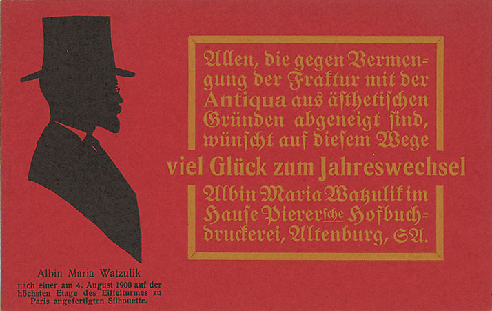
A humorous New Year card of Watzulik’s: ‘Everybody, who dislikes the mixing of blackletter and roman typefaces of esthetique reasons, is in this way wished a Happy New Year.’ Below his profile the text says that the silhouette was made after he had climbed to the upper floor of the Eiffel tower in Paris August 4th, 1900. (Probably sent for New Year 1901)
The personal correspondance between Watzulik and Kirste from the years 1901 and 1929 is now in the archives of Kirste, together with several New Year cards from the years around 1900. These are without doubt made by Watzulik himself. Kirste was, as mentioned above, engaged in the efforts to sell Watzulik’s collection of printed specimens in the 1920s.
When Watzulik turned 80 years in 1929, Kirste wrote a lengthy article about him in the Norwegian trade journal Nordisk Trykkeri-Tidende no. 3, 1929. It was republished in an edited form in no. 5, 1929 of Tegn og Tale – the journal of the Association for the Norwegian deaf. In the former article Kirste writes:
Watzulik's work over sixty years has been very versatile and extensive. His effective prospectuses and circulars, his original advertisements, his artistically composed diplomas, sample sheets and title pages for ink factories and type foundries, his unique New Year's cards and many other jobbing prints will stand throughout all time as excellent examples of perfect typography. (...) Watzulik has been both an artist and a technician, and as such he has often created typographic compositions, which are some of the best and most perfect we own. In certain periods of time, his work is unobtainable.
When Kirste wrote this, the ideals in typography were quite different from Watzulik’s heyday. Functionalism in typography, ‘the new typography’, had started making itself felt, soon also for Kirste’s own practice. His warm words for Watzulik testify also to his great respect for an abandoned typographic period, which Kirste had adhered to himself.
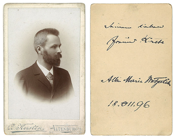
Albin Maria Watzulik’s portrait with a greeting to his friend Kirste on the back side, dated November 18, 1896.
The contact with Hermann Scheibler
Hermann Scheibler (1854–1929) trained as a compositor in Zittau in Saxony in Germany. After leaving this small printing office as a skilled journeyman, he travelled and worked in several European countries before he settled down in Christiania (Oslo) in 1878. He was employed at Fabritius, and after many years became the sole owner of this fairly big printer. He was dedicated to the printing trade and took an active role in several organizations to promote the art of typography, as well as writing several textbooks for the trade.
Before leaving Germany for Christiania (Oslo), his last employment was at Pierer’sche Hofbuchdruckerei in Altenburg, where he met Albin Maria Watzulik. In his autobiography he notes::
... after a few months I sought employment in the large and well-respected printer for the court, Pierer in Altenburg. Here I was introduced to one of the most capable typographers in Germany, the foreman Albin Maria Watzulik. I am greatly indebted to him, as he has given me many a piece of useful and instructive advice in the problems of typography, and I have also received many encouragements.
The extensive correspondance between Hermann Scheibler and Watzulik is now in The National Archives in Oslo, partly in Fabritius’ and partly in Hermann Scheibler’s archive. Their correspondance reveals, among other things, that Scheibler in 1899 planned an exhibition of Watzulik’s typographic achievements in Christiania. As mentioned above, Scheibler contacted Watzulik in 1896 when he looked for ‘an absolutely competent compositor in jobbing typography’, which made Max Rich. Kirste come to Norway.
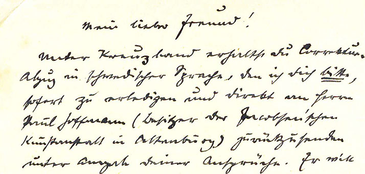
A section of one of many letters from Albin Maria Watzulik to Hermann Scheibler in Christiania. Most of them start, as this one, with ‘My dear friend’. Like the rest, this letter is not dated.
Watzulik had a strong relationship with the Norwegian printing trade. He influenced the two prominent printers Scheibler and Kirste, who in the next round greatly influenced the Norwegian printing trade through their writings and organizational activity.
Watzulik’s standing today
In the beginning of this article, I asked why Watzulik was so highly regarded in his lifetime, and why he is so little talked about today.
The style period which he is primarily associated with, artistic printing, has subsequently been rated low. For those in the classical tradition, with ideals dating back to Renaissance printers in Italy and France, this represents a complete slippage from the principles of tasteful typography. Those on the opposite side, with a modernistic, functionalist attitude to typography despise its excessive ornamentation and effect-making. And there have not been many who have familiarized themselves with this style to understand it, and absolutely not to learn from it and be inspired by it. My book Da typografien ville være kunst has tried to accomplish this. There are also other new initiatives like this, which shed light on the decorative typography of the 1890s.
During the 1990s, within the postmodernistic style in the graphic arts, the traditions of both classical and modernistic typography were broken. This is for me an obvious parallell to artistic printing, but this connection was not made clear for the graphic community.
The significance of Watzulik has today been ignored, just as the artistic printing itself. But the reason for his present anonymity can also be that he was only one of several competent typographers in jobbing printing at the time. The international specimen exchanges of this period testifies to the numerous talents at work in the printing trade. Maybe he got a disproportionate good reputation in Scandinavia, because he was published in the Swedish Boktryckeri-kalender and had personal relations to Hermann Scheibler and Max Rich. Kirste in Norway.
Any information about Albin Maria Watzulik is welcome!
IN NORWEGIAN
Denne artikkelen er en oversettelse av den norske. Den lille forskjellen er at i den engelske versjonen er alle som sto bak arbeidet med å prøve å selge Watzuliks samling av trykk nevnt, ikke bare skandinavene.
First published in Norwegian in 2014
Translated to English, revised and extended in January 2025
Last revised 11.02.2025
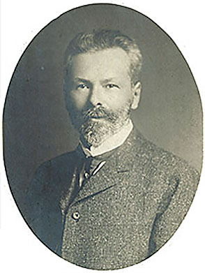
«The primus of typography» Albin Maria Watzulik (1849–1930).
IN NORWEGIAN
This article is also available in Norwegian.