The typography of the late 19th century in a ground-breaking book
‘Artistic printing’ in Norway
The central theme of my book Da typografien ville være kunst of 2021 is the typography of the late 19th century, first and foremost in jobbing printing, a style called ‘artistic printing’. At the time it was regarded as a promising way forward for raising the standards of the letterpress printing trade, but throughout the century to follow artistic printing was characterized as a ‘misunderstanding’ and as ‘messy’ and being an indication of decline. My book argues for an alternative view.
By Torbjørn Eng
Artistic printing is, in short, lavishly decorated, employing a multitude of brass rules, often curved, and with a predilection for casted, generic illustrations. It is often colour printed, while breaking new ground by challenging established principles of typographic form, such as symmetry, and it is characterized by a multitude of novel typefaces, often in an exuberant mixture. Artistic printing strives for originality. It differs clearly from earlier, less decorated and more neutral typography.
The background to artistic printing can be summarized in four points. In the Victorian age, products of industry and the applied arts were in general heavily decorated, so it was only natural that typography should follow suit. Secondly, the 19th century saw great technological progress in the graphic trades, among them in typefounding and colour printing, which made artistic printing possible. Thirdly, an increased struggle for the attention of the public, who at the time were offered a new abundance of printed matter, demanded more intriguing visual forms. Last, but not least, the growth and development of lithographic printing, with its freely created letters, decorations and illustrations, challenged the technically more restrained letterpress printers.
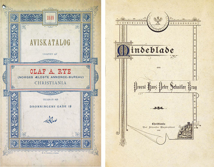
LEFT: The cover of the price list for Olaf A. Ryes Annonce-Expedition, dated 1889, is an example of historicist typography. It is decorated with a border based on renaissance motives, which were highly appreciated in the years before artistic printing. Olaf A. Rye was one of the first Norwegian advertising agencies. The price list was printed by Fabritius & Sons.
RIGHT: Book cover showing a number of the characteristics of artistic printing. Non-symmetrical title lines, often breaking out of ornamental borders, are one of them. Another is the decorative use of casted generic illustrations, as in the lower right corner. A number of rules, often curved, are, as always, present here. The ‘lifted’ leaf at the bottom is one of many ways a three-dimensional illusion was attempted in artistic printing. Mindeblade om Provst Hans Peter Schnitler Krag (Memories of Dean Hans Peter Schnitler Krag), printed by Det Steenske printing office in 1895.
Prior to the advent of artistic printing there was an interest in historicist (also known as ‘old style’ or ‘antique’) printing. Historicist typography, relying heavily on decorations from earlier periods in the applied arts and architecture, played only a small role in Norwegian printing. Nevertheless, several remarkable works using renaissance friezes or classical architectural ornaments deserve notice. This historicist typography belongs first and foremost to the 1880s while artistic printing dominated the 1890s. Contrary to the historicist approach, artistic printing employed new decorative material without historic references, mixed new, fanciful advertising typefaces, and challenged the traditional practices. In the 1890s this typography was at the centre of attention in the Norwegian printing trade.
The origin of artistic printing can be found in the US, where printers were less bound by traditions than their European counterparts. From America emerged a number of technical innovations in the printing trade in the late 1800s, among them the jobbing platen press and the pantographic engraving machine, which opened up for new practices. Artistic printing spread from the US to Great Britain (there called ‘Leicester Free Style’) and to the European continent. German printers, typefoundries and trade press exercised, as always before, a strong influence on the Norwegian printing trade. As the Germans coined the phrase ‘die freie Richtung’ for artistic printing, ‘den frie retning’ (the free style) also became the Norwegian term.
Many Norwegian craftsmen have traditionally travelled as journeymen for a few years after finishing their apprenticeship, going to Denmark and further afield, mostly to Germany, in order to work and learn. This was also the case with several compositors and printers of the late 1800s, who later became prominent. Among them were Morten Johansen, who after returning to Norway from Germany in 1877 became a regular contributor of work in the artistic typographic style, and later acquired his own printing office.
A number of foreigners also travelled to Norway, recognizing the opportunities in the growing printing trade, and a few of them established themselves here. Hermann Scheibler of Saxony settled in Christiania (today’s Oslo) in 1878, and became an inspirer for artistic printing in Norway through his great talents in typography and his extensive writing for the printing trade. He maintained a large international network that included the influential Albin Maria Watzulik of the Pierer’sche Hofbuchdruckerei in Altenburg in Germany, and he followed the international trade press.
Da typografien ville være kunst takes the beginning of the 19th century as its starting point, in order to take the rapid development of the Norwegian printing trade throughout the century into consideration. At the time, printing was very limited, as Norway was part of Denmark, and printing and publishing were concentrated in Copenhagen. The Norwegian state was established in 1814 (until 1905 in a union with Sweden), and economic and social progress in the following years made a sizeable and modern printing trade possible.
In the two last decades of the 19th century, decorative printing was at the centre of a remarkable wave of activity in the Norwegian printing trade. In 1888 unionized print workers, master printers and academics organized a non-political trade organization in Christiania – ‘Den grafisk-tekniske Forening’ (The Graphical-Technical Association). In its statement of purpose, it argued that ‘beautiful, artistic and stylishly printed matter are in increasing demand, even in Norway’. It held meetings and exhibitions, ran a competition and produced a booklet about typography and proof reading. The initiator, Hermann Scheibler, published three major works on typography and advertising in the following decade. His illustrated textbook of 1896 – Lære- og Mønsterbog for Typografer (A compositors’ manual and specimen book) is a thorough guide to jobbing printing, ornaments, colours and ‘the free style’. From 1892 Christen Thorvaldsen, the master printer of Centraltrykkeriet, published and edited Norway’s first graphic trade magazine, Nordisk Trykkeri-Tidende (Nordic Magazine for Printing) with compositor and tradeunionist Olav Bergenn.
During the 1890s Scheibler was foreman at Fabritius & Sons, one of Christiania’s major printers. He was one among several people in the printing trade internationally whose aim was to produce ‘typographic art’ from type and decorative material, with the goal of raiseing the status of their skills and the trade. This led to the start of several international exchanges of printed specimens. A number of Norwegian printing firms, along with individual printers and compositors contributed to the British Printers’ International Specimen Exchange and the German Internationaler Graphischer Muster-Austausch des deutschen Buchdrucker-Vereins. The largest Norwegian participation was in 1895, when three printing firms and three individuals contributed specimens in the style of artistic printing to the German exchange.
The enthusiasm of the first years of artistic printing was increasingly moderated by criticism. Some found artistic printing overcrowded by decorative devices and by too many different typefaces. ‘Some jobbing compositors have the fixed idea, that every open space must be filled’, wrote August Mortensen in 1893. Another objection was that executing the style was technically too complicated and time-consuming, to be profitable for the printer. An indication of this is that many of the preserved objects in this style are for the printing trade itself.
By the turn of the century, artistic printing was challenged by the works of William Morris’ Kelmscott Press and, of greater importance in Norway, by the new decorative style art nouveau. Thereafter, artistic printing was discarded and looked down upon, partly even forgotten as a part of printing history. The same negativ attitude applied to every field of Victorian design. But while most design of the late 1800s, like the period’s architecture and furniture, has been re-evaluated during the last 50 years and included in the design heritage, artistic printing has only been appreciated and studied in a few recently published works. It is noteworthy that the term ‘free style’ and many of its characteristics have no parallel in other fields of the design of the day.
Da typografien ville være kunst maintains that artistic printing was a natural and important part of Victorian design culture. Many talented compositors and printers of the day produced visually impressive and technically complicated printed matter, which satisfied a general understanding of ‘good taste’.
Two pages from Da typografien ville være kunst.
NORWEGIAN SUMMARY
Dette er en kort analyse på engelsk av den typografiske stilperioden «den frie retning» og hvordan den artet seg i det norske fagmiljøet, sammen med en omtale av min bok Da typografien ville være kunst, som er blitt møtt med en viss interesse fra utlandet. Norske lesere anbefales denne sida.
Først publisert 04.05.2023
Sist revidert 04.05.2023
Torbjørn Eng
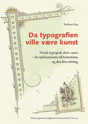
Da typografien ville være kunst :
Norsk typografi 1800–1900 – fra nyklassisisme til historisme og den frie retning.
192 p. Hardback, more than 250 illustrations in four colours. Oslo: Typografi i Norge. 2021. Reprinted in 2022 with minor corrections.
Da typografien ville være kunst (‘When typography would be an art form’) is the hitherto untold story of Norwegian 19th century typography – from neoclassicism at the start of the century, through a romantic period around 1840, then on to historicist and ‘artistic printing’ during the two last decades, after which art nouveau appears on the scene.
The various forms of typographic expressions are analyzed with references to other fields of design and against the background of technological and organizational developments within the printing trade. The book also takes into account the competition from the new lithographic printing technique and the economic and social advances in 19th century Norway, which created a need for many new types of printed matter.
The emphasis is on the end of the century, when typography was characterized by an abundance of rich decorative material and new typefaces, especially in printed ephemera, like invoices and business cards. Traditional principles of typographic form were put aside, in order to create visually effective and ‘elegantly’ printed matter.
In most printing and graphic design textbooks, ‘artistic printing’ is mentioned only briefly, or not at all. A short overview of its history in Norway, and a presentation of its general characteristics, may be of international interest. The reception of my book from abroad in the form of a number of orders, is a telling sign, even though it is in Norwegian. Four pages in English are included in the second printing of my book, and this text is published here, with small modifications.
A PDF of 23 pages is available here.
Da typografien ville være kunst can be ordered from here. It costs NOK 350 sent abroad, including postage.