From the first inspirations to the zenit around 1930 and the following re-thinking
The ‘New Typography’ in Norway
‘The old, classical typography doesn’t apply to the needs of today; it can’t express the feelings and thinking of modern man’, master printer Arthur Nelson in Oslo wrote in his trade journal Norsk Trykk in 1929. A radical, so-called ‘new typography’ with roots in the Soviet Union and Germany flooded these years into Norway. The ‘new typography’ belonged to the emerging functionalism, which put its mark on many fields of applied arts and on architecture.
Av Torbjørn Eng
Who introduced the new typography to Norway, and how was it met? How was it practised? This part of Norwegian printing history is not yet explored. (Note: This text was written in 1998, and new research has been published since then, see the end of this article.)
Before answering this, it should be explained what the new typography is all about – and the ‘old’ typography as well. The new typography‘s background in the development of modern society, of trends in the arts and design and of international politics should be clarified.
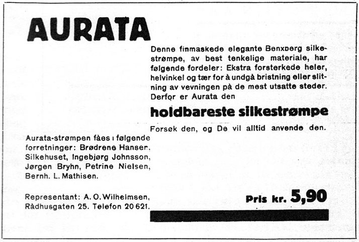
An example of an advertisment in the new style of ’new typography’. The text is divided into groups which are placed asymmetrically on the printed area (contrary to symmetri along the central axis). Type of extra bold weight is used in order to emphasize the most important elements, and the chosen typeface is a sans serif. The thick line represents the minimum of an eye-catcher that the new typography could accept (contrary to decorate the object with ornaments, elaborate borders etc). This ad illustrated Harald Clausen’s article ‘Den nye typografi: foredrag i Det grafiske selskap’ in Norsk faktortidende no. 3 1930, and is probably an example work.
Breaking away from harmony
The new typography breaks with the traditional symmetrical form, where text is placed along a central axis. It is wrong to adjust a text to a fixed form, according to the functionalists of the ‘new typography’. The form of a text should rather be determined by its function. The text should be grouped in a clear way, and placed in a, for the reading process, sensible way on the entire printed area. The most important text should be emphasized with powerful means. In the ‘old’ typography a harmonious form was sought after, in the ‘new typography’ tension and contrast were wanted.
Ornaments, which were previously used to embellish printed objects, were now banned as they were considered unnecessary and because they stole attention from the text. At most, lines and geometric ornaments (circles, triangles and squares) could be used. And preferably sans serif typefaces should be used, which were believed to have the simplest and clearest form.
A mechanical and rational form of production was to characterize the printed works. Sobriety was a keyword.
Advocates of the new ideas believed that the era they now lived in had changed to such an extent that it required a new typography. The pace of everyday life was faster – for example, people no longer read everything in a newspaper, line by line. Therefore, the message had to be clarified with powerful means so that the reader could quickly determine what interested him or her to read.
‘The age of machines has changed the public taste’, wrote Arthur Nelson, one of the first advocates of the new typography in Norway, in 1929. The functionalists believed that they were at a crossroads between the old and decayed and the new and youthful. They were characterized by a revolutionary spirit.
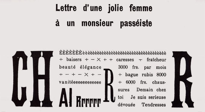
A poem from Marinetti's book Les Mots en liberté futuristes (Milan 1919). Tschichold writes in Die Neue Typographie that it was Marinetti, a non-professional in typography, who deserved credit for initiating the transition from ornamental to functional typography.
This attitude can be traced back to the Italian Filippo Tommaso Marinetti, a Futurist artist who was fascinated by the speed of the new era, its cars and its planes. In 1909, he published a manifesto for a typographic revolution: against the old typography which was still in the harmonious style of the 16th century, and for a style that expressed the new era, a typography where one could use three or four different colors and twenty different typefaces on the same page to express the content: ‘a typographic-pictorial page’.
With his expressive, personal style, Marinetti was far from a functionalist. His significance lay in arguing for a break with the traditions of typography and instead creating a style in line with the modern society.
Jan Tschichold
The foremost proponent of the new typography, Jan Tschichold, carefully described the development of styles like impressionism, cubism, futurism and expressionism to explain the background for the new typography. He believed that these art movements had unsuccessfully attempted to save traditional painting (which was threatened by photography) while the society that had upheld it was going under. Nevertheless, the radical artistic works of these movements were an essential prerequisite for the new typography.
Jan Tschichold was a German calligrapher and book designer who, after being convinced by the new radical ideas, became the foremost proponent of the new typography among German graphic designers. In 1925, he edited an issue of Typographische Mitteilungen, published by the German print workers’ professional education association in a circulation of 24,000. This issue was titled ‘elementare typographie’ – another name for the new typography. And it’s no coincidence that the text on the cover was set in only lowercase letters: many radical typographers believed that uppercase letters had no function and should therefore be abolished.
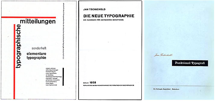
Three of Jan Tschichold’s (1902–1974) publications: first, Typographische Mitteilungen (1925), then the title page of Die Neue Typographie (1928), and finally the Danish translation of his Typographische Gestaltung (1937, first published in 1935). After the Nazi takeover of Germany in 1933, Tschichold was arrested – the Nazis strongly opposed the international modernist style. He emigrated to Switzerland. However, he later distanced himself from the new typography. He believed that it was just as uniform and absolute as Nazism itself, and he then supported the old, classical ideals. Tschichold later designed the serif typeface Sabon, widely used also today.
Tschichold wrote that World War I had been a turning point in the social order: ‘The only credible thing in this chaos [after the war], that truly ‘lives’, that belongs to the present, is what the engineers and technicians create, their buildings and machines.’ He believed that the individualistic works of free artists had to give way to rational and collective creative works, where the engineer was central.
The Russian revolution
It was a common feeling that the old social order had collapsed during World War I. But what was the new order? In Russia, the Bolsheviks’ October Revolution had introduced a new socialist order that inspired many in Western Europe. Jan Tschichold himself changed his first name to Iwan in admiration of the October Revolution.
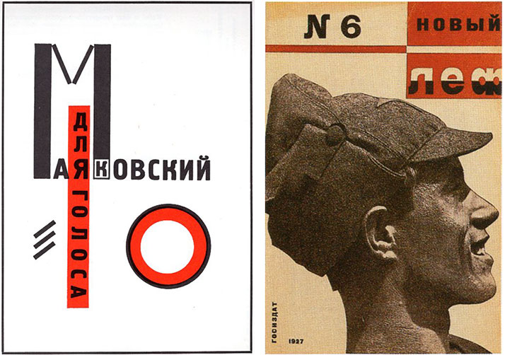
The new typography drew much inspiration from Russian and Soviet revolutionary art and design. On the left is the cover of Vladimir Mayakovsky’s For the Voice (1923), designed by El Lissitzky. On the right is Alexander Rodchenko’s cover for the magazine Novyi Lef no. 6, 1927.
During the early years of the Soviet Union, radical graphic expressions had a prominent place, in part because during the years of civil war and revolutionary changes, there was a great need to disseminate propaganda. This required a form with emphasizing and use of symbols and photographic images on posters and the like. Photomontage, which would become part of the program of the new typography, was widely used.
Tschichold wrote that the new typography drew lessons in particular from the Russian constructivism, an art movement that used materials such as steel, glass, and wood. It declared war on all exclusive art that was separated from real life. The goal was a completely new culture, where industry and art were fused together, and where artists gave shape to utilitarian objects.
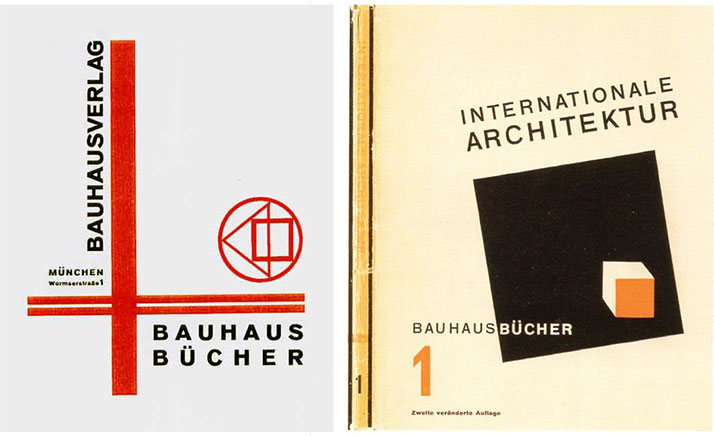
To the left is a brochure announcing the release of Bauhaus books (1924), in the typical Bauhaus style. To the right is the first release, Internationale Architektur by Walter Gropius (1925), designed by Farkas Molnár.
In the years following World War I, there were several artists and artistic communities across Europe working along similar principles. The Bauhaus school in Weimar, Germany was especially significant. It was after visiting the Bauhaus exhibition in 1923 and through contact with modernist artists that Tschichold began to orient himself towards the new style. However, these artists worked on a small scale and were rather isolated; Jan Tschichold’s merit was that he conveyed the new ideas to the general print worker.
It was particularly his book Die Neue Typographie. Ein Handbuch für zeitgemäss Schaffende (The New Typography. A Handbook for Modern Designers) from 1928, published by the German graphic education association, that made the new principles feasible in the daily work in print shops. After a thorough introduction to both the old and new principles of typography, he demonstrated in this book how the new typography could be used in various typographic works, such as letterheads and advertisements.
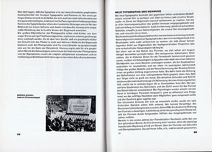
A spread from Jan Tschichold’s Die Neue Typographie (1928). Note the bold page numbers, the body text set in sans-serif typeface without paragraph indents, the left-aligned paragraph titles, and the asymmetrically placed image with an asymmetrically placed caption.
The situation in Norway
Norway was only to a small extent affected by the destruction of the war, but there was also a political radicalization going on here. What was happening among German professionals and in German trade journals quickly became known, as there had traditionally been a close relationship between Norwegian and German printers. Some had been trained there, some had spent their formative years in German printing houses when travelling as journeymen, and Germany was Norway’s absolute top supplier of type and other equipment. Typefoundry specimen books, where new typefaces were demonstrated in use, influenced many in the trade.
‘No one is wrong in seeing Bolshevism in the modern style,’ said Harald Nyholm, chairman of the Swedish Printing Association at the Nordic Printing Council meeting in June 1929, where printer M. R. Kirste was one of the three Norwegian participants. But the new typography was not reserved for the radicals: it was to play an important role within the modern capitalist society, namely in advertising.
Advertising was of little significance in Norway before 1914. The economic boom during World War I brought about a significant change, and advertising associations and agencies were established in the largest cities. Some referred to it as an ‘advertising movement’.
The new typography, with its ideal of effectively reaching out with a striking form, was perfectly suited for advertising. The new typography, implemented in ads, gained widespread acceptance in the print shops.
Arthur Nelson
There was a fertile ground for the new typography in Norway. As early as in 1929, the printer Arthur Nelson wrote: ‘Now the style revolution is in full swing.’
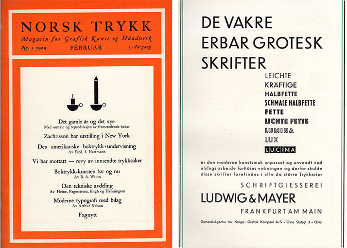
Arthur Nelson and his Norsk Trykk played an important role in conveying the new typography to the Norwegian printing industry. The journal was started in 1927, and the cover of 1929 no. 1 is shown here. Despite the modernist message of the journal at this point, its form was traditional and symmetrical. The illustration on the cover (candlesticks) was composed of typographic elements, a practice which was considered ‘modern’ in Nelson's and several other printers’ eyes, but was hardly rational or practical from a production standpoint. Norsk Trykk was also an important advertising platform for graphic suppliers. On the right is an advertisement for the popular ‘funkis’ typeface Erbar Grotesk, printed in Norsk Trykk issue 2, 1930. The advertisement itself is an example of the asymmetrical ‘new typography’.
First, some points that make up part of the background when the new typography took root in Norway:
Increased professional interest
There had been efforts for several years to raise the level of printing and the graphic arts in Norway, which laid the foundation for the great professional interest with which the new typography was met.
New organizations and publications emerged. Two should be mentioned: Norsk Boktrykk Kalender – a yearbook with articles on historical, technical, and aesthetic subjects – was published from 1918 by a committee in the printer’s union in Oslo. A few years later, in 1927, Arthur Nelson started the trade journal Nelsons Magasin for Grafisk Kunst (later Norsk Trykk) (Nelson’s Magazine for Graphic Arts / Norwegian Printing).
The level of quality in workmanship had also been raised. The apprenticeship training, which had been criticized for being poor and haphazard, was put in order through the establishment of the Vocational School for Printers in 1908 (in Oslo), which provided three years of theoretical and practical evening classes. In 1922, a preparatory school for typography apprenticeships was also started. Furthermore, in 1927, Harald Clausen’s textbook in typography Typografi was published, the first typography textbook in Norway since 1896 (Hermann Scheibler’s Lære- og Mønsterbog for Typografer). (Note: I have later become aware of Eugen H. Rübsamens small booklet Aksidenssats from 1912.)
Growth in advertising
As mentioned in the previous article, advertising grew in significance after 1914. Advertisements with a basis in design had been a part of graphic production since the end of the previous century, and Hermann Scheibler at the Fabritius printing company wrote about advertising as early as in 1898. However, it was during World War I that, for example, designed newspaper advertising became widespread.
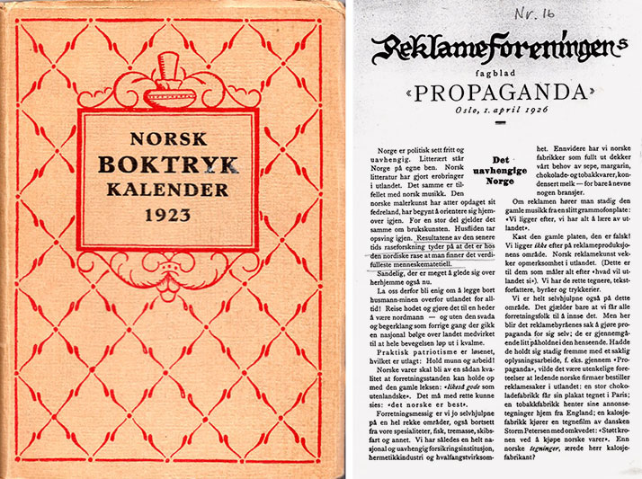
There was a resurgence of activity in the printing and graphic design community in Norway in the 1920s. On the left is the Norsk Boktryk Kalender for 1923, a trade book that was published annually from 1918. On the right is the Advertising Association's magazine Propaganda, which was started in 1922. Shown here is issue number 16 from 1926.
Robert Millar founded the first Norwegian advertising club in Trondheim in 1914. In 1922, the publication of the trade magazine Propaganda began, and in 1927, Norges Reklame-Forbund (Norwegian Advertising Association) was established. Propaganda wrote that the industry's opportunities were ‘great, even immeasurable’ – advertising agaencies saw advertising as a lever for the economic progress.
Advertising agencies and design studios were established. The increased advertising activity created new opportunities for printing companies and led to a new link – advertising professionals, with their specialized expertise – between clients and printers. Many advertisers eagerly embraced the new tools of typography. ‘These people have completely revolutionized ad layout,’ wrote printer Rolf Torp in Norsk Boktrykk Kalender in 1934.
Neoclassicism
It was printer Arthur Nelson and his magazine Norsk Trykk who first asserted the modernist ideas in Norway. However, in the magazine’s first issue in the autumn of 1927, this was not yet a topic: ‘We find ourselves in a transitional period – from the heavy German school to a more pure, classical direction,’ he wrote. Just like in architecture, there was a conflict at this time between a national and a neoclassical line.
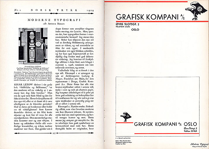
An spread from Norsk Trykk no. 1, 1929. On the left, Nelson’s article ‘Modern Typography,’ illustrated with a painting of the French artist Fernand Leger. On the right, two examples of modern typography: a letterhead and an envelope for the graphic supplier Grafisk kompani. Asymmetric in form, the text is set in the geometric sans serif typeface Erbar, and red lines serve as eye-catchers. Nelson created many such typographic model objects.
Nelson immediately became involved in a heated debate with the printer Max Rich. Kirste on this. ‘Norwegian typography is an art with its own distinctive, national character,’ Kirste wrote in Nordisk Trykkeri-Tidende, and accused Nelson’s magazine of being designed in an American style. In response to Kirste’s criticism of the journal’s qualities, Nelson listed all his qualifications from his career as a printer.
Functionalism was the answer to the conflict between these two points of view: a few years later both Nelson and Kirste became supporters of the internationally influenced ‘new typography’. Just like the printer Harald Clausen – he wrote a series of articles in Norsk Faktortidende in 1928 where he discussed the prerequisites for an ‘independent Norwegian direction in typography.’ Such a theme was miles away from the international style that the new typography represented.
In 1927, a large international book art exhibition was held in Leipzig, Germany. Here, many people got their first impressions of the new style. Director Thor B. Kielland of Kunstindustrimuseet (The Museum of Applied Arts) in Oslo conveyed his impressions in the Norsk Boktrykk Kalender of 1929, and particularly emphasized the Russian section as one of the most interesting: ‘This was truly revolutionary book art, with all the old typographic rules turned upside down, all the latest ‘isms’ put to work in decoration and illustration, all kinds of techniques used together and at once.’
Often commented upon
After this, we often see the new style referred to in professional journals, usually with reservations, but as something everyone had to deal with. Nelson wrote in Norsk Trykk no. 1, 1928 that he was a supporter of a block style with strong contrasting effects like the German style, ‘but in my opinion, they have exaggerated the system, as the text is killed by the ‘elements’.’ He also couldn’t bring himself to abandon his beloved roman typefaces, Caslon in particular.
In Norsk Trykk no. 4, 1929, he was more unreserved: ‘Norwegian printers should be able to apply the elementary typography according to the Norwegian temperament. The sharp, serious block-like effect should be particularly suitable for Norwegian taste, which is mainly formed by an asymmetric wild nature. The gray, symmetrical typography should, for the same reason, be distant from us.’
Printed samples of the new style, as interpreted by Arthur Nelson, were inserted into Norsk Trykk. In the autumn of 1930, these were collected together and published under the title Typografiske mønstre (Typographic patterns).
Nelson was also a widely used lecturer. In January 1930, as an example, he gave a lecture at Det Grafiske Selskap (The Graphic Society) titled ‘The modern style in typography’.
Det Grafiske Selskap was founded in 1929 in the wake of the increased professional interest brought about by the new typography. (Note: the society still existed in the 1990s.) The typeface, the basic element of typography, was placed at the center of the new style, and this appealed to many professionally interested individuals. The society’s meeting invitations throughout the 1930s, often designed in the new style, provide a good picture of the new typography’s grip on the professionally interested.
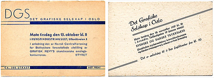
The invitation cards for meetings in Det Grafiske Selskap during these years were strongly influenced by the new typography. Sans serif typeface, or the so-called Egyptian typeface (typeface with uniform line thickness and slab serifs), was common, often contrasted with a script typeface. The arrangements were often asymmetrical or had a typical tendency towards block composition (text shaped as a quadrangle). These are from 1931 (on the left) and 1937.
Norsk Trykk contained a variety of articles on historical, technical, and news-related topics within the printing trade. One of Nelson’s merits was that he initiated several typesetting competitions during these years.
Studying automobiles
In a competition organized by the printer’ union in Oslo together with the union of foremen in print shops in 1929, the judges rejected the only modernist contribution as ‘localized in Germany and hardly worthy of ...’. Nelson criticized this decision and encouraged Norwegian typesetters to ‘study the new style and practice it. They will find ideas in the new architecture, modern paintings and illustrations, and especially in the lines of modern machinery. Some of the latest car models, for example, have the most beautiful lines.’
Nelson often argued that printing companies should engage more in advertising. Like many others who had worked in the United States, he had seen the importance of advertising in a developed capitalist society. He recommended, among other things, that there should be a layout person in every printing company, and he shared many views with the advertising agencies.
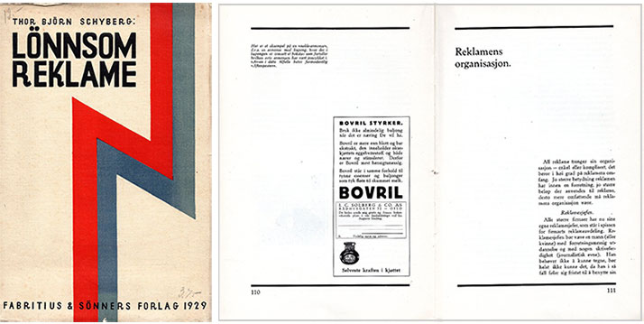
Thor Bjørn Schyberg's Lønnsom reklame (Profitable Advertising), published by Fabritius & Sønners Forlag in 1929, was a very early and radical work in the new style. It was so original that the author explained himself in an afterword: ‘The typography of this book may possibly appear somewhat peculiar. In this connection, I must explain that the typesetting and arrangement of illustrations in every detail have been planned by me. The printer and publisher have followed my drawings, and therefore, the responsibility for the typography of the book lies with me.’
An advertising professional, Thor Bjørn Schyberg, was responsible for creating one of the first and most radical works in the new style – it was even a book. The former chairman of Norsk Reklameforbund’s (The Norwegian Advertising Association) Lønnsom reklame (Profitable Advertising) was not set in sans typeface (but rather in the roman typeface Nordic (Genzsch) Antiqua), but had a strikingly asymmetrical, two-column layout with heavy horizontal lines. This was so unusual that the author took full responsibility for the typography in an afterword.
Compositors (skilled typesetters, journeymen) and master printers also played a role in the propagating for the new style. By around 1930, most of the leading figures in the graphic design industry in Norway had embraced the new typography, and the style began to make its mark on printed materials.
Two of the foremost figures in the Norwegian printing community at this time were master printer Max Rich Kirste and compositor/teacher Harald Clausen. Both are remembered for their textbooks, which were still used up until the 1980s.
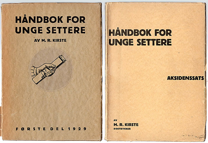
The prominent printer Max Rich. Kirste (1873–1948) embraced the new typography and became one of its most important advocates in Norway. His Håndbok for unge settere – Annen del, Aksidenssats (Handbook for Young Typesetters – Part Two, jobbing printing) from 1935, was firmly rooted in the new typography’s principles. The asymmetrical cover design is in accordance with this style The first part of this textbook, from 1929 (on the left), has a traditional symmetrical form.
After pondering the idea of giving typography and typefaces a distinctively Norwegian touch as late as 1928, both became supporters of the new typography, which was, in contrast, an ‘international’ style. They were not alone, as the new style appealed to many professionally interested individuals due to its focus on typography and functional typesetting solutions.
Kirste and Clausen
Kirste had a German background, owned a highly respected printing house, and was an active trustee for the master printers. He had many international contacts and was in contact with the Swedish printing community, which was influenced by the new style earlier than the Norwegian one. The trade journal Nordisk Boktryckarekonst, which had many readers in Norway, was positive about the new typography as early as the autumn of 1928. The Stockholm Exhibition in the summer of 1930, which showcased Swedish craftsmanship and industry, had a functionalist framework that demonstrated the style’s importance in Sweden. The exhibition was also considered important in Norway.
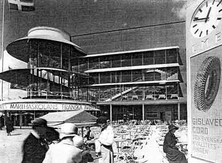
The Stockholm Exhibition of 1930 has been characterized as the breakthrough year of functionalism in the Nordic countries, largely due to the exhibition’s architecture. Architect Gunnar Asplund created a large functionalist architectural environment on Djurgården. The lettering on the buildings appears to have been the new geometric sans-serif font, Futura.
In the spring of 1930, Kirste wrote that printers must embrace the new trend in typographic style, the new typography, for one reason because customers want their printed material in this style. He wrote that styles come and go, and ‘I don't think it's useful to swim against the current. It applies here as always, that everyone must follow the times, the new time.’
The summer of 1930 there was a congress for printers and a advertising congress at the same time in Trondheim. Kirste gave an enthusiastic speech in favor of the new typography, stating that ‘there is a great and beautiful task for us in the new typography,’ and he saw it as an opportunity to raise the standard of Norwegian printing. He also organized an exhibition of examples of modern typography during the congress.
Harald Clausen gave a lecture on the new typography in Grafisk Selskap in March 1930. Clausen explained the principles behind the new style and criticized certain excesses, but emphasized the advantages of elementary typography in advertising. This lecture received widespread dissemination by being reproduced in both Norsk Faktortidende (the magazine for the foremen in the printshops) and Nordisk Trykkeri-Tidende (the printers’ magazine). In addition, Typografiske Meddelelser (the printers’ union’s magazine) reported on the meeting in great detail.
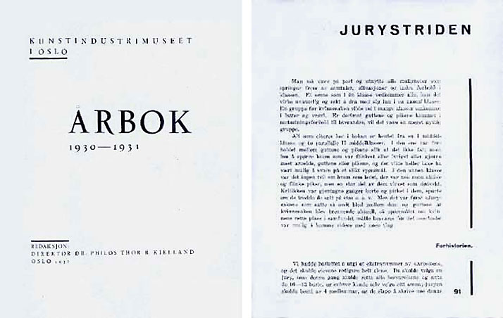
Two examples of book design in line with the principles of ‘the new typography’: The director of Kunstindustrimuseet i Oslo (The Museum of Applied Arts), Thor B. Kielland, allowed leading Oslo printers to experiment with the new design ideals in the production of the museum's yearbook. The yearbook for 1930–31 was produced by Emil Moestue Boktrykkeri A/S (the title page on the left). The typeface is a roman, but the text is arranged asymmetrically. - On the right, a chapter page from Olav Storstein's modernist-designed Barn 1932 (Children 1932), published by the socialist Fram publisher, Oslo 1932. Here, the chapter title and section title are placed asymmetrically, and a vertical line runs along the outer edge of all pages in the book.
So much was said and written about the new typography in 1930 that we can conclude this was its breakthrough year, even though much work in this style would be done in the following years.
Advertising
In 1930, Norsk Trykk held an advertising sketching competition together with the newspaper Tidens Tegn, and in issue 6 of the same year, Norsk Trykk summarized that the most remarkable thing was that ‘all the prize winners and most of the participants have carried out their work according to functionalist principles; the text groups are arranged asymmetrically, which means that old rules of balance based on the central axis have been thrown out the window.’
In an article about Aftenposten, it was stated that ‘the new typography is currently going berserk in our advertising columns’, and Nelson praised the newspaper’s ‘new face’. He examined the newspaper‘s larger ads in December 1930 and found that 20% of them were set in the ‘modern style’ and 34% in a sans serif typeface.
At this time, the new typography was starting to gain some traction, but primarily in jobbing printing such as advertisements, brochures, posters, etc., not in books. Kirste wrote that ‘elementary typography is not the same as book art. These two things must be strictly kept separate from each other’. The rationale was that books are read differently than advertising, the latter is meant to capture attention and quickly convey a message. Advertising was a new communication medium that required a new form, while books were read as they always had been, and therefore should not be changed.
This attitude was challenged when the Norsk Boktrykk Kalender 1931 was published. It was arranged asymmetrically, used geometric eye-catchers, and the titles were set in a sans serif typeface. A large part of the editorial content was also devoted to the new typography.
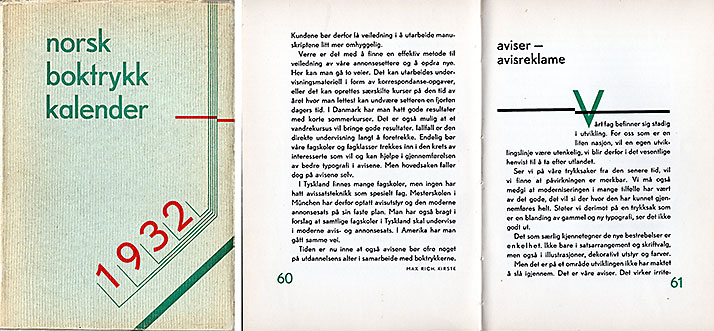
The 1932 edition of the Norsk Boktrykk Kalender was very radical in its form, although some of the techniques used seem rather enforced. Note that capital letters are omitted on the cover and in the titles. The yearbook was printed at Kirstes Boktrykkeri in Oslo based on drafts by Lars A. Olaussen. In the article ‘The new typography in our newspapers’, Kirste writes, among other things: ‘Just as architecture has freed itself from facade ornamentation, furniture from carvings, etc., typography should also free itself from all superfluous ornamentation or unsuitable typefaces.’
All subsequent Norsk Boktrykk Kalender up to 1940 were in the new style. The most radical was the 1932 calendar. Here, the main text was set with the sans serif Berthold-Grotesk, and capital letters were omitted in the titles.
The book art enthusiast Thor Kielland, director of the Kunstindustrimuseet in Oslo, who wrote regularly for Norsk Boktrykk Kalender, among other things, was engaged in the new typographic style. He let the production of the museum’s yearbook be shared between seven leading Oslo printers with the intention of allowing the printers to experiment with type and layout. The three yearbooks published in 1930, 1931 and 1932 all had a simple, asymmetrical graphic form.
Considering the origins of the new typography in politically radical artistic circles, it was natural that the socialist publishing house Fram (linked to the socialist organization Mot Dag) published books in the new style. Also Gyldendal publishing house was open to the new ideas. In 1933, they published Knut Hamsun’s Benoni typeset with the sans serif typeface Gill Sans. In the same year, Rolf Jacobsen’s poetry collection Jord og jern received a beautiful asymmetric cover, which in Einar Økland’s Norske bokomslag 1880-1980 is called ‘a visual landmark’.
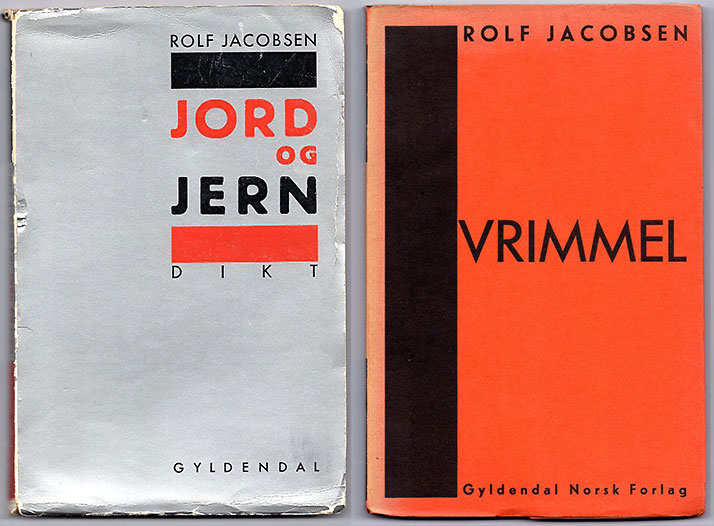
Rolf Jacobsen’s two poetry collections from 1933 and 1935 both have a beautiful asymmetrical form. Jord og jern has been given the place of honor on the title page of Bokens ansikt, a major history of Norwegian book covers, published in 2002. The cover must therefore rightly be considered the best among Norwegian book covers, in addition to representing Norwegian graphic functionalism at its best. It is most likely the same designer who was behind the two covers, but he or she is unfortunately unknown.
These two Gyldendal publications were both among the ten selected books in the competition ‘Årets vakreste bøker’ (The most beautiful book of the year) in 1933. A third, Norway today from Sverre Mortensens Forlag, was also in the new style.
Trade journals
Arthur Nelson’s magazine Norsk Trykk, which early on took a position in favor of the new typography, seems to have gradually become isolated. One gets the impression of Nelson as an outsider in the printing community, perhaps as a result of the fact that he thought highly of himself and could strike a rather ironic tone in his columns. In Norsk Trykk No. 1, 1931, he claimed e.g. that the publication of Norsk Trykk was the reason for the increased interest in typography among printers in recent years. Nelson’s claims were strongly refuted in the magazines of the master printers, foremen and unionists, and for the next few years these wrote very little about Nelson and his work.
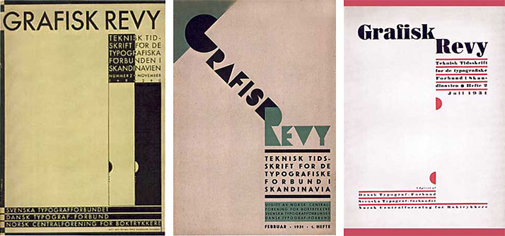
The joint Scandinavian trade journal Grafisk Revy was an important mouthpiece for the new typography. From left, the covers of 1930, No. 2, 1931 No. 1 and 1931 No. 2.
In 1930, the publication of a joint Scandinavian trade journal, Grafisk Revy, began. It was published by the printers’ unions in Sweden, Denmark and Norway, and was modeled after the German Typographische Mitteilungen. The editor, Swedish Nils Wessel’s main article ‘The new style in typography’ in the first issue was also largely based on Jan Tschicholds writings. Grafisk Revy stood for the new typography’s ideas in both form and content. The magazine gained a strong position among Norwegian typographers, and they largely contributed to its content.
Afterthought
At the same time as they were positive towards the principles behind the new typography, people such as Kirste, Clausen and the advertising artist Trygve M. Davidsen had several critical objections to what they considered to be the excesses of the style. They argued e.g. that the demand for only sans serif typefaces was too strict, because it would make it difficult to create unique, original printed matter – moreover, sans serifs were tiring to read in length. Some parts of the functionalist style were simply not functional, was a common perception. But without the excesses, it is a healthy style, Davidsen wrote in Propaganda in May 1931.
But after the new typography had swept into the Norwegian graphic community in the years 1930–1931 without encountering much opposition, more fundamentally critical voices would gradually rise. An editorial in Nordisk Trykkeri-Tidende no. 12, 1931 entitled ‘Den nye smaksretningen’ used expressions such as ‘massivness’, ‘improper pursuit of effect’ and ‘a caricature’ in its attacks on this new style. The magazine’s editor was B. A. Wium. ‘A little more of Gutenberg’s spirit won’t hurt," was an expressed opionion in another issue.
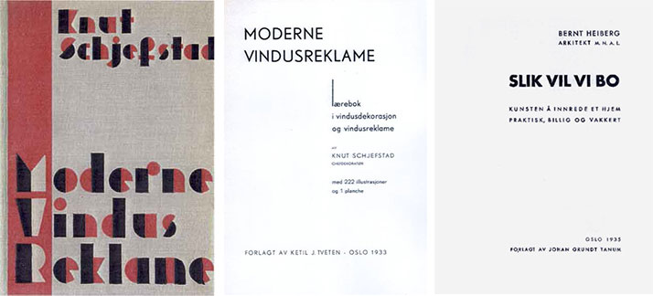
Two books in the new style. To the left is the cover and title page of Knut Schjefstad’s Moderne Vindusreklame (Modern window advertisement) (1933), printed in Kirstes Boktrykkeri, Oslo. To the right, the title page of Bernt Heiberg’s Slik vil vi bo (How we want to live) from 1935, printed at Reistad & Sønn, Oslo. – The geometric sans serif typefaces on the two title pages shown here are respectively Berthold-Grotesk and Futura (Bauer).
The international center of the new typography had been Germany. But in January 1933, the Nazis took power and put an end to all international, socialist and experimental artistic expressions. Blackletter typefaces were given prominence. Nordisk Trykkeri-Tidende, which editorially was negative about the new typography, in no. 3, 1934 favoured this change, and saw it as a postive part of a German national reconstruction. The magazine wrote: ‘It will be interesting to see if these powerful conflicts are content to stay within Germany’s borders.’
The reactionary backlash in Germany probably contributed to curbing graphic modernism in Norway as well, but there was a lot of work done in the new style also in the following years. And Kirste’s Håndbok for unge settere, annen del – aksidenssats (Handbook for young typesetters, second part – jobbing typesetting) from 1935 asserted the principles of the new typography with conviction.
The new typography led to greater freedom and more appropriateness in the design. On the basis of the first radical principles it developed further, it became less dogmatic and rigid. And it had to settle for living side by side with the classic typography. But that's another story...
Many older colleagues have contributed information and material that has made this article possible. Among these, I would especially like to thank Torgrim Andersen and Arnstein Kirste (both now deceased). Ole Lund at NTNU University has given valuable advice during the preparation of the manuscript.
For a later, more detailed history covering all of Scandinavia, I recommend Trond Klevgaard’s The New Typography in Scandinavia: Modernist Design and Print Culture of 2020.
NORWEGIAN SUMMARY
Denne artikkelen er en lett omarbeidet versjon av de tre artiklene jeg i 1998 skrev om den nye typografien i Norge, på nettet her.
Publisert første gang i 14.05.2023.
Sist oppdatert 06.06.2023.
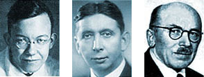
PIONEERS OF THE NEW TYPOGRAPHY
These three individuals can exemplify the disposition of this article, which originally in 1998 was divided in three parts: on the left, the German designer Jan Tschichold, a theorist of the new typography, especially in the 1920s – in the middle, Arthur Nelson, the one who first championed these new ideas in Norway through his trade journal Norsk Trykk, most enthusiastically around 1930 – on the right, the renowned Oslo-based printer Max Rich. Kirste, who incorporated the new principles into his diverse work and in his textbooks for the printing trade in the mid-1930s.